We originally launched Planning Alerts in October 2009. That feels like a lifetime ago.
In that time all sorts of features have been added, there have been visual redesigns, and we’ve introduced many little improvements and fixes. Yet nothing we have done before feels as substantial and meaningful as what we’re launching today.
On the face of it, the changes you see may seem like a visual redesign. In fact we’ve researched thoroughly and thought deeply. Taking this approach, we think we’ve created a really beautiful and usable design that is so much clearer and more satisfying to use.
While the new look might be a little jarring at first, we think you’ll come to appreciate it quickly.
We’re just so happy after so much work to finally share it with you!
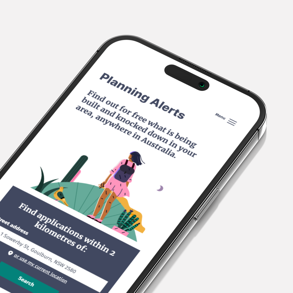
This is what we are aiming to achieve with the new Planning Alerts:
- Simple: Clean and uncluttered interface
- Extremely legible: Easy-to-read text across all devices.
- Accessible – big type and high contrast
- Welcoming
- Human: Small touches of whimsy to remember we’re people
- Not be government-y: Distinct and friendly design
- Trustworthy: Improved transparency, without compromising ease
- Respectful space: Inviting clear respectful interactions
- Show a little more of the process under the hood so that people can interact with the service more productively, know what it’s doing, and be more confident that it is doing what you expect it to do.
Simple, Extremely legible and Accessible
The new site has big legible type across all screen sizes with good colour contrast everywhere. While no substitute for manual accessibility testing, we’ve also added automated accessibility testing as part of our test suite. This allows us to make changes more confidently, knowing that we’re less likely to inadvertently reintroduce some old accessibility problem.
Human Touches and Respectful Space
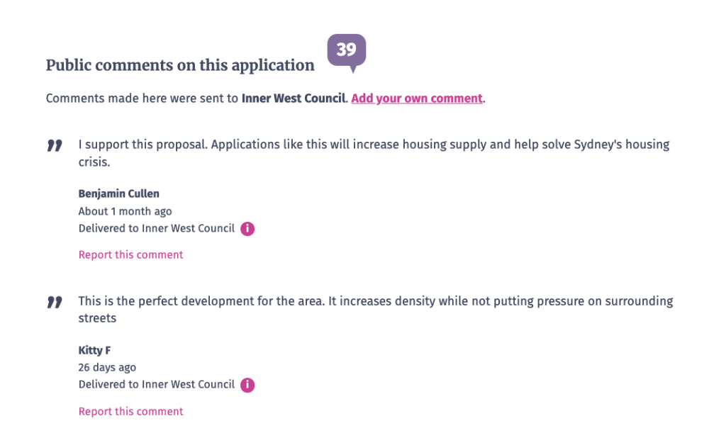
You’ll find illustrations of people as a subtle reminder that you’re in good company. There’s a symphony of other people here. People around Australia, people in our community and people working behind the scenes in government bureaucracy all read our comments and connect with our words. And of course we, the people running the service do too. This is a service for everyone, so when you make a comment, remember not everyone looks or thinks the same way as you. We all deserve to be part of a respectful dialogue helping to shape the built environment around us all.
Welcoming and Not Government-y
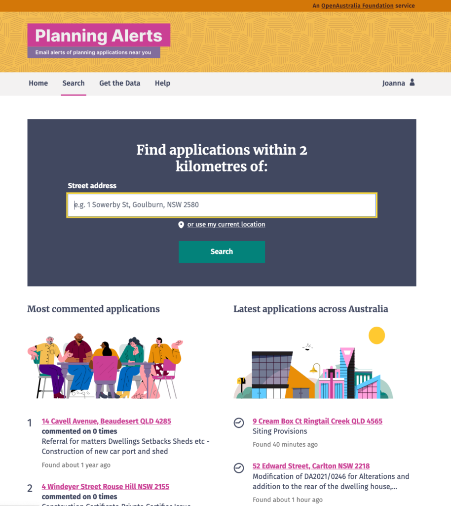
Colours! They’re a little idiosyncratic and we love them. They’re warm but not overbearing, cute but not cutesy, diverse but coherent… we think it would be hard for you to think this was a government service.
Transparent and Trustworthy
Trust us, we have made some changes aimed at increasing transparency and trustworthiness. For example, when you write a comment, from now on you’ll preview the full email before it’s sent to council instead of Planning Alerts magically delivering it to the planning authority. This is so you can double check what you’ve written and better understand any privacy implications. Importantly, you will also see more clearly exactly what will be sent to council and what’s publicly displayed on the site.
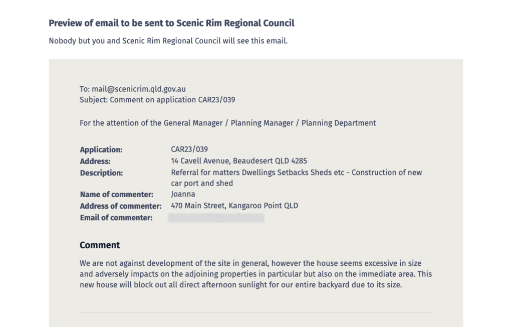
One of the many things we learned in the research is that we’ve embedded a lot of our values and ethics into decisions we’ve made that have very specific outcomes on how we present planning information. However we haven’t always spelled these out directly. We are also working to ensure these values are clearly expressed not just in our hearts, they’re also explained in our web pages and communications. One key example is our commitment to protecting your privacy.
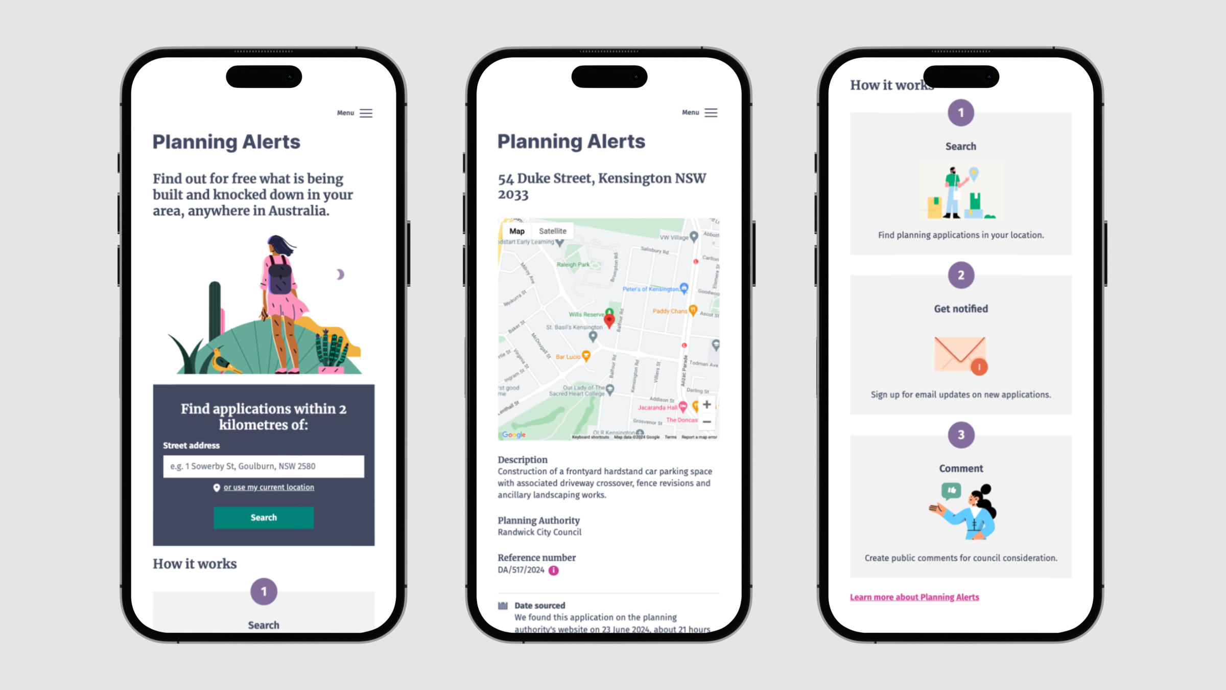
Also, we realise the mechanics of the service haven’t always been clear to new users. So we’ve added a “How it works” section on the home page.
This is Just the Beginning
This redesign is just the start of a new stage for Planning Alerts.
While we think this is a more polished redesign than we have ever launched before, inevitably there will be rough edges or things that just aren’t working as they should. So, please, if you find something that seems weird or wrong or could be better, please share your thoughts with us. We really depend on you sharing your experience to help us focus on better meeting your needs.

2 Comments
I am impressed! Thanks guys for being so steady and reliable…
Well done on the website redesign – I like it!